

We love Shopify as an ecommerce platforms for large and smaller businesses alike. Our 3PL services integrates seamlessly with Shopify and other online stores. So, we decided to take our knowledge of design and UX to select our top 5 sites, giving you our impressions and pros & cons for each. All 5 happen to be amongst the top 100 Shopify sites in terms of revenue as well. We don’t make any analysis on their products or service, this is only an exercise in UX and design.
Who are we? Speed Commerce is an end-to-end provider of outsourced customer experience solutions for ecommerce retailers (including for Shopify and Bigcommerce and more) as well as manufacturers, for close to 20 years. We grow our clients’ businesses by providing winning customer experience strategies such as 24/7/365 ecommerce customer service, order fulfillment, and warehousing – get a free quote from a fulfillment expert.
Our Criteria for UX
Evaluating websites for UX involves a systematic approach to examining elements that contribute to a user’s overall experience on the site. The goal is to identify strengths and areas for improvement to enhance usability, engagement, satisfaction, and ultimately, the effectiveness of the website in achieving its intended goals. Here’s a general framework for how we evaluate websites for UX:
First impressions: assess the initial impact of the website on a user. This includes design appeal, clarity of what the site offers, and the immediate sense of the brand’s identity.
Navigation: evaluate how easy it is for users to find what they are looking for. Good navigation is intuitive, logical, and requires minimal effort from the user. Consistency in navigation elements across the site is also important.
Content clarity and relevance: analyze whether the content is clearly written, relevant to the user’s needs, and supports the site’s objectives. Good content should be engaging, easy to read, and well-structured with headings, bullet points, and concise paragraphs.
Visual design: assess the visual appeal of the site, including the use of color, spacing, font choices, and imagery. The visual design should align with the brand and enhance the user’s ability to process information and make decisions.
Interactivity and engagement: examine how the website engages users through interactive elements, such as links, buttons, forms, and multimedia. Interactivity should enhance the user experience and not detract from it.
Accessibility: evaluate how accessible the website is to a diverse range of users, including those with disabilities. This includes assessing color contrast, keyboard navigability, alt text for images, and adherence to other accessibility standards.
Mobile responsiveness: given the prevalence of mobile device usage, assess how well the site functions on mobile platforms. This includes loading speed, ease of navigation, and how well content and interactive elements adapt to smaller screens.
Loading speed: analyze the site’s performance in terms of loading times, as slow-loading sites can frustrate users and lead to a higher bounce rate.
User journey and conversion: understand the typical pathways users might take on the site and how effectively the site guides them towards taking desired actions, whether that’s making a purchase, signing up for a newsletter, or another goal.
User testing and feedback: where possible, real user testing can provide invaluable insights into user experiences, preferences, and frustrations. This can be done through usability testing sessions, surveys, and feedback forms. For this exercise we’ve done some informal polling within our organization but that is the extent of it.
Brooklinen

Clean without coming off as thin, in terms of content, is how we’d describe Brook Linen. This is one of the best overall approaches we’ve seen for brands that don’t have tons of SKUs and lots of technical info to deal with.
Pros:
- Visual appeal: The website features an attractive and clean design, which enhances user engagement and establishes a strong brand identity.
- Ease of navigation: Clear and intuitive navigation is a major plus, allowing users to easily browse different categories and find what they’re looking for.
- Product information: The site provides detailed information on products, including reviews, which can significantly aid in the decision-making process.
- Promotions and offers: The visibility of promotions (like the 15% off for the first order) is well-executed, potentially boosting conversion rates.
- Mobile responsiveness: The site is responsive and appears to function well on mobile devices, which is absolutely key for user accessibility and satisfaction.
Cons:
Some overwhelming choices: While having a variety of products is good, the presentation might overwhelm new visitors. Streamlining product introductions could enhance user focus.
Pop-ups and notifications: The site uses pop-ups and notifications, while common, can sometimes distract users or disrupt the browsing experience if not implemented judiciously.
Rating and Final Thoughts:
We rate the Brooklinen website at 8/10. It excels in visual design, user navigation, and product information, creating a generally positive user experience. However, there’s room for improvement in managing user engagement through pop-ups and possibly refining the checkout process to ensure it’s as efficient and user-friendly as possible.
To further enhance UX, Brooklinen could consider simplifying the user journey by minimizing distractions and focusing on a seamless path from product discovery to purchase.
Indestructible Shoes
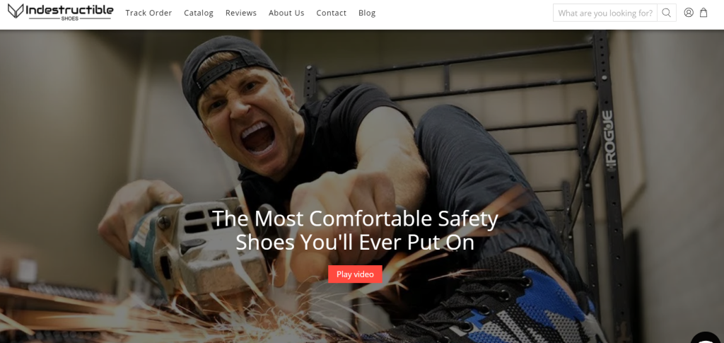
These folks have taken a non-fashion type of shoe and presented them in a friendly and attractive way, balancing the risk of over-styling elements with the need to deliver clear messaging and technical information.
Pros:
Product focus: Effectively highlights its unique value proposition—durable and safe footwear. The product images and descriptions are clear and compelling.
Ease of navigation: The navigation is straightforward, with a simple top menu and easy access to product categories and other important sections like reviews and contact information.
Engaging content: The use of engaging content, including video and customer testimonials, helps build trust and convey the product’s benefits.
Clear Call-to-Action (CTA): The CTAs are prominent and clear, encouraging users to explore products or make purchases.
Responsive Design: The site adapts well to different screen sizes, ensuring a good user experience across devices.
Cons:
Visual clutter: The homepage feels a tad cluttered with too many elements vying for attention, which can overwhelm users and detract from a focused user journey.
Pop-ups and Interruptions: If there are any aggressive pop-ups or chatbot interruptions, they can be distracting and potentially annoying to users.
Load Times: Without specific details, it’s unclear if load times are optimized. Slow loading can negatively impact user experience and site performance.
Product variety presentation: While it’s important to showcase product variety, the presentation could potentially be overwhelming and might benefit from more streamlined, curated selections.
Consistency: Ensuring consistent branding and design elements throughout the site is crucial for a cohesive user experience. Any inconsistency can confuse or detract from the brand identity.
Rating and Final Thoughts:
We rate the Indestructible Shoes website at 7.5/10. The site does well in highlighting its products and providing an easy navigation path. However, improvements could be made in reducing visual clutter and refining the user’s journey to focus more on conversion and less on distraction.
To enhance UX, they could benefit from simplifying its layout, perhaps by using more whitespace and a more focused content hierarchy. Streamlining the number of choices presented at each step can help users make decisions more confidently and reduce decision fatigue. Regular user testing could uncover specific areas where users might experience confusion or frustration, allowing for targeted improvements.
Secret Lab
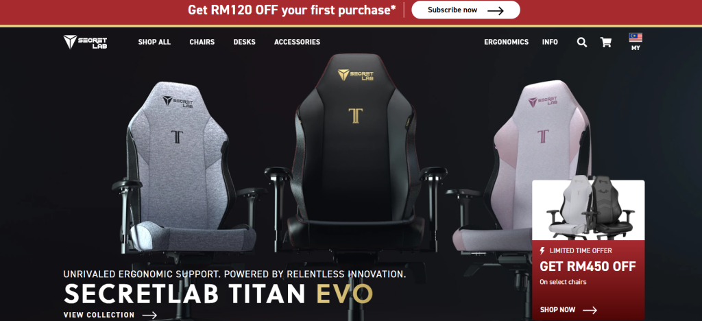
Secret Lab specializes in gaming chairs but the site doesn’t chase away the non-gamer with flashing lights and an overload of RGB color themes. The casual gamer or even the gamer-curious would feel comfortable browsing and purchasing from the site.
Pros:
Focused product display: The site effectively showcases its gaming chairs and desks in a tasteful manner, emphasizing their ergonomic benefits and quality. The products are the stars here, with high-quality images and detailed descriptions.
Intuitive navigation: The site’s navigation is user-friendly, with clear categories and a search function that helps users find products or information quickly.
Engagement features: The inclusion of customer reviews, endorsements from professional gamers, and various media mentions helps build trust and engage users.
Educational content: The site offers detailed explanations of the ergonomic benefits and technological features of its products, educating users and aiding in their decision-making process.
Responsive design: The website is well-optimized for different devices, ensuring a good user experience regardless of the platform.
Cons:
Information density: Some users might find the amount of text and technical details overwhelming, especially if they are just browsing or not yet decided on a purchase.
Visual complexity: While the design is sleek and thematic, the abundance of dynamic elements and detailed imagery might distract from the main conversion goals for some users.
Promotional pop-ups: Again, if a site uses pop-ups for promotions or newsletter sign-ups, these could interrupt the browsing experience, particularly if they are difficult to dismiss or appear too frequently.
Loading time: Very high-quality images and videos enhance the user experience but could also impact page loading times, especially on slower internet connections.
Product comparison: While the site offers a range of products, users might find it challenging to compare them directly without a more streamlined comparison feature.
Rating and Final Thoughts:
We rate the Secretlab website at 8.5/10. It communicates the quality and ergonomic benefits of its products, with a focus on user education and engagement. The site design aligns well with the brand’s premium positioning in the market. However, improvements could be made in balancing detailed content with user-friendly design, optimizing loading times, and refining the comparison process to aid decision-making.
BOMBAS
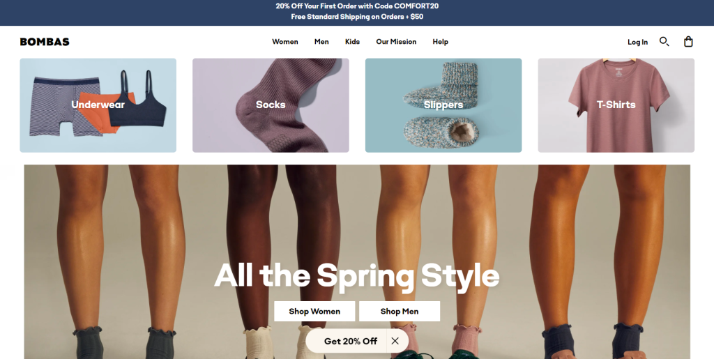
Bombas goes for no-nonsense and ease-of-navigation over frills and clutter and we like the results.
Pros:
Clear mission statement: The emphasis on the company’s mission of donating to those in need with every purchase adds a strong emotional appeal and enhances brand loyalty.
Simplified navigation: The site offers straightforward navigation, making it easy for users to find different categories of products and important information about the company and its mission.
Product presentation: The products are displayed clearly, with high-quality images and concise descriptions that make browsing enjoyable and informative.
Incentives for engagement: Offering a discount for the first purchase in exchange for an email sign-up can be a good strategy to enhance user engagement and build a customer base.
Customer support visibility: Highlighting the availability of a dedicated “Customer Happiness Team” is excellent for building trust and ensuring users feel supported.
Cons:
Visual overload: Depending on the page, the mix of products, social mission information, and promotional offers might overwhelm users, especially new visitors.
Discovery process: While the navigation is straightforward, the site could potentially improve how users discover different products or learn more about their social impact.
Mobile experience: Ensuring that the mobile experience is as seamless and intuitive as the desktop experience is important, given the increasing trend of mobile online shopping.
Rating and Final Thoughts:
We rate the Bombas website a solid 8/10. It has a strong brand message and user-centric design elements, such as clear navigation and product presentation. However, there is room for improvement in managing content density to prevent potential user overwhelm and optimizing the site for speed.
Enhancements could include refining the balance of content and whitespace to improve readability and focus, as well as ensuring that any pop-ups or additional interactive elements enhance rather than detract from the user experience.
Bajaao
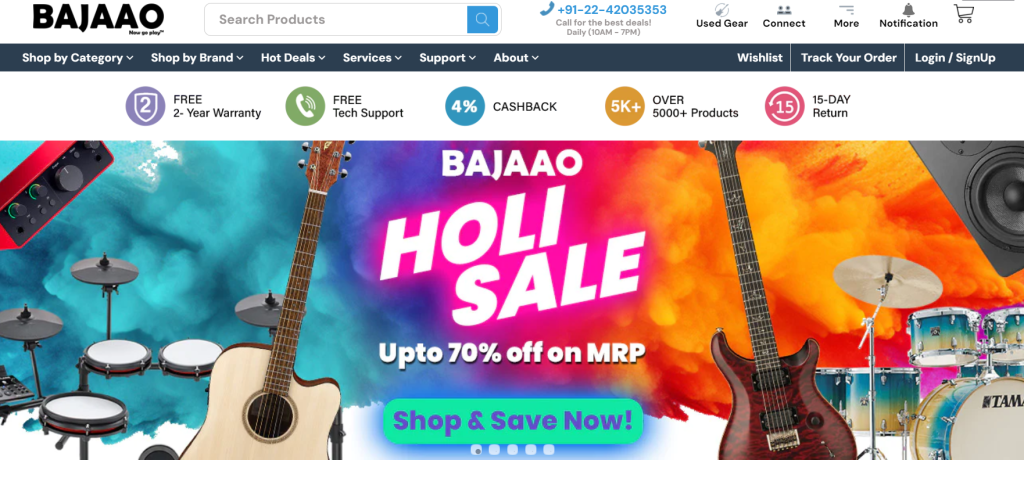
There are a lot of brands, SKU’s, categories of musical instruments but the site skillfully makes these easy to navigate and FAST to peruse everything. There are good callouts to important products and categories without looking too cluttered and an active blog to boot.
Pros:
Product range: The site offers an extensive selection of musical instruments and equipment, catering to a wide variety of customers, but everything is easy to scan and absorb without needed to hunt or click-around needlessly.
Search and filter: The site provides robust search functionality and filtering options, which help users find specific items based on their needs.
Informative product pages: Each product page is detailed with specifications, images, and sometimes reviews, which help in the decision-making process.
Educational content: The inclusion of guides, blogs, and tutorials can be a significant value addition for users, especially beginners looking for guidance.
Clear Pricing and Deals: The website highlights pricing, discounts, and deals clearly, which is essential for making informed purchase decisions.
Cons:
Visual and information overload: The website still contains a vast amount of information and products, which can be overwhelming and lead to decision fatigue for some users.
Consistency in user interface: Ensuring a consistent user interface across various pages can enhance the user experience, making it more predictable and user-friendly.
Page load times: High-density content and images can impact load times; optimizing these elements can improve the overall user experience. This factor is also increasingly used by Google Search as a ranking factor so it’s one to watch.
User engagement features: While the site has substantial content, additional interactive features or community engagement elements could enhance user involvement and loyalty. With musical instruments, the opportunity is certainly there.
Rating and Final Thoughts:
We would rate the Bajaao website at 7.5/10. It serves as a comprehensive platform for musical instruments and audio equipment, with robust search and filtering tools. However, enhancing the visual hierarchy and information presentation could significantly improve user experience. Streamlining content, optimizing for performance, and enhancing the mobile experience are key areas for improvement.
To further refine UX, Bajaao could implement a more focused content strategy, reducing clutter and prioritizing information based on user needs and behaviors.
Bohme
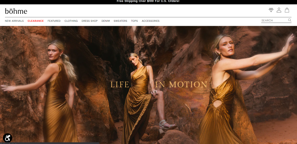
The images are artful and stylized but when it comes to UX, the site is well laid out and easy to use – no fluff or frustration here.
Pros:
Aesthetic appeal: The site features a stylish and modern design that aligns well with its fashion-forward brand identity, offering an appealing visual experience.
Product display and information: Products are showcased effectively with clear, high-quality images and detailed descriptions, which aid in the shopping decision process.
Navigation: The navigation is intuitive and user-friendly, with well-organized categories that make it easy for users to find specific items or explore different sections.
Engagement and incentives: The inclusion of a discount for first-time subscribers and clear communication about sales and promotions can enhance user engagement and encourage purchases.
Mobile responsiveness: The website adapts well to mobile devices, ensuring a good browsing experience across various platforms.
Cons:
Content density: Some pages may feel overly crowded with products and information, which could potentially overwhelm users and detract from a focused shopping experience.
Pop-Up usage: If there are intrusive pop-ups or too frequent promotional messages, these could disrupt the user experience and deter users from continued (or repeated) browsing.
Loading time: High-quality images and design elements can impact page loading speeds, which is crucial for maintaining user engagement and satisfaction.
User journey clarity: While the site is generally well-organized, ensuring that users have a clear pathway from discovery to checkout can further optimize the user experience.
Interactive elements: The site could potentially enhance user interaction by incorporating more dynamic elements like hover effects, product previews, or personalized recommendations.
Rating and Final Thoughts:
We’d rate the Bohme website an 8.5/10. It provides a strong visual appeal and a user-friendly interface that aligns well with its brand. However, focusing on optimizing content density, improving page load times, and potentially enhancing interactive features could further refine the user experience.
To improve UX, Bohme should consider streamlining content presentation, ensuring that promotional elements are engaging but not intrusive, and conducting regular performance optimizations.